![]()
Just give me the TLDR
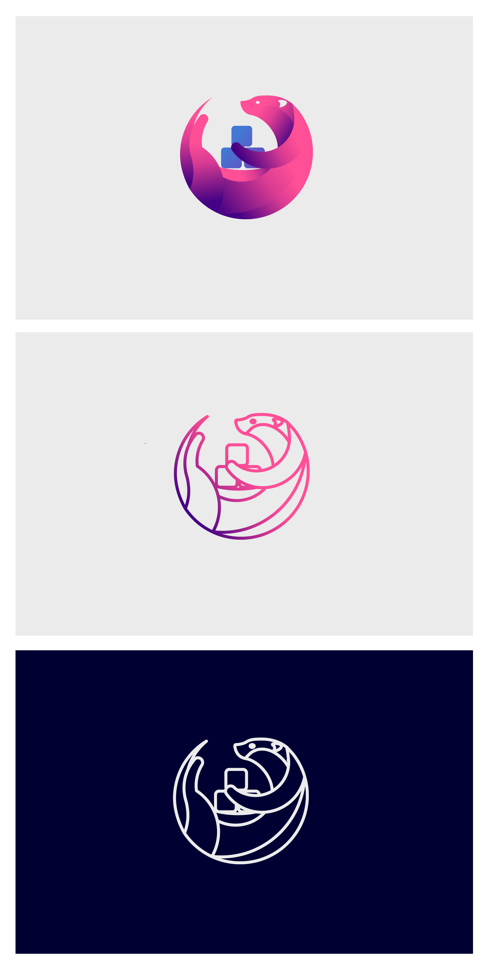
It was time for a new logo, and the one above is what we finally decided on. Some people say it looks like the Firefox logo, while some people say what has an otter got to do with linuxserver? The former is due to our group being plagued with old people with bad eyesight, but the latter is a good question.
Where Docker has the whale as a logo, we thought using an otter would be a nice homage to that; an otter is a water based mammal but unlike a whale it's small and agile. The otter is carrying his own collection of personal containers, which is in line with what we do — we make containers people want to use on their personal network. We don't make every container under the sun, but we do make "THE BEST CONTAINERS IN THE WORLD" (according to TheLamer's Guinness Book of Made Up Jeremy Clarkson Facts).
All joking aside, this weekend marks a major milestone in our growth. We hit 10 Billion (yes, with a B) pulls on DockerHub which is a testament to how popular our containers have become. We would like to thank everyone who continues to use our containers and those who have supported us over the years. If you would like more information check out this post.
"Lets get a new logo" they said. "Let's put Kode in charge of sorting it out" they said. "It will be the most awesome logo ever!" no-one said, but it turned out better than I expected so here's the story of how the new logo came about and some lessons learned.
How we decided on a winner.
Both the final design and the finalists were decided by a condercet vote. This was chosen to try and make the decisions as fair and impartial as possible as well as providing winners that were the most representative of most peoples preferences.
That sounds easy, but in reality it was a case of me hounding people every day to get feedback and to get them to vote in a timely manner.
How we went about it
As a group we decided to spend a bit of money on a new logo, and by a bit I mean we checked down the sides of our collective sofas to find what loose change could be scrounged. Hiring a(n expensive) professional was therefore out, so I decided to try the next best thing; I started a design contest on 99 designs and hoped a few professionals would be interested enough to enter alongside 5000 amateurs.
In reality, a massive thanks go out to everyone who has donated via OpenCollective. Without your support we wouldn't have the funds to do things like a rebrand, so thank you all.
In retrospect, we would probably have been better finding someone who we really liked and working with just them, but hindsight is always 20/20 and instead I went into this enterprise bright eyed and bushy tailed and full of hopeful exuberance...
 Just a short 3 weeks later
One of the big challenges I faced was while I had been appointed in charge of the project, I wanted everybody to have a say in which logo we finally went with. To that end I would ping @everyone daily in the team channel, to get their feedback and opinions. I would also individually ping people who I was still waiting for answers from, even I was annoyed by myself!
Just a short 3 weeks later
One of the big challenges I faced was while I had been appointed in charge of the project, I wanted everybody to have a say in which logo we finally went with. To that end I would ping @everyone daily in the team channel, to get their feedback and opinions. I would also individually ping people who I was still waiting for answers from, even I was annoyed by myself!
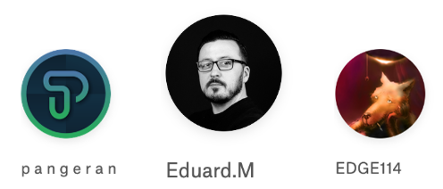
 When the first round of submissions was nearing the end I made a spreadsheet of all the people who hadn't already been struck off, from that list we narrowed down our choices to six people.
 The problem with competitions like this is the designers are essentially working for free until finally a single person gets all the money. It doesn't inspire people to do their best work. After speaking to the rest of the team I sent the following to the 6 we had in the short list:
 With that flagrant violation of 99 designs terms and conditions out of the way, we waited to see what the six would produce in the final few days.
After being informed of the violation and threatened with up to 27 years in prison (in reality 99 designs customer services were really nice, thanked me for looking after their designers but made sure I understood I had to pay them for extra work through the correct channels, whoops), I quickly updated everyone to let them know we would be paying them in the correct way through 99 designs as a private project afterwards.
I decided to do the voting via Condorcet so for the first round where we would whittle the 6 designers down to 3 I created a spreadsheet where people could put their votes, then I created a Condorcet vote manually and input the values from the google spreadsheet.
Then there were 3
Once we were down to our final 3 we had a few days to work with them to get a final design ready to make our final decision on the winner.
 Once the time was up I asked everyone who wanted to take part in the final vote to pick a winner to perform a task:
@everyone I would like everyone to attempt a simple exercise for this final round
I want everyone to attempt some critical thinking, for each entry imagine that it's your favourite design and list all the things that are good about it, then imagine you hate the design and put the reasons why.
The conclusion section for each entry should be where you put forward any biases you have and counter any points you made in the bad section, if you don't want to add any comments then feel free to ignore the conclusion section, I'd still like everyone who is going to vote to do the other bits as at the very least it will get you to think about each logo critically and not just making a snap judgement.
Then email me you entries and I'll compile a document with all the responses in.
I want us to use this document when we make our final decision and base our decisions on the points in this document.
Format: Eduard.M - Otter design The good: point 1, point2, etc The bad: point 1, point 2, etc Conclusion: (optional)
P a n g e r a n - LS Hexagon The good: point 1, point2, etc The bad: point 1, point 2, etc Conclusion: (optional)
EDGE114 - Penguin The good: point 1, point2, etc The bad: point 1, point 2, etc Conclusion: (optional)
Once everyone had had a chance to send me their submissions I created a document with a compiled list of all the responses, which can be seen on this google sheet
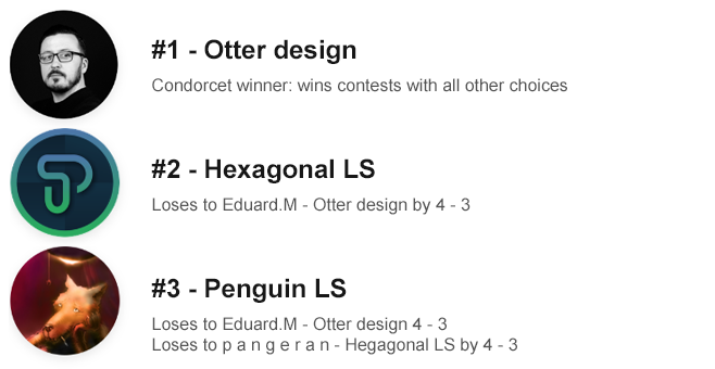
Finally I gave everyone some time to read the document and consider it, then I emailed everyone who had participated a link to cast their vote on the final Condorcet poll, the results of which were:
The final design
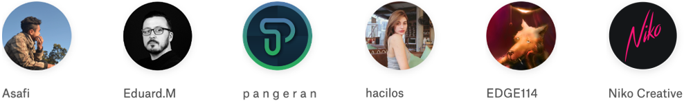
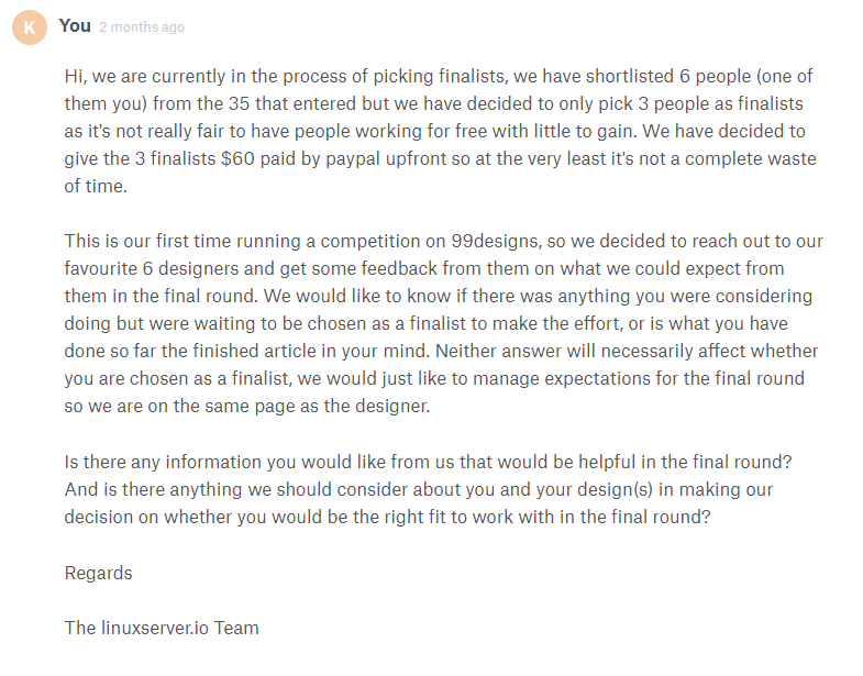
We were fortunate to get both a solid version and a line drawing version making the logo more flexible in more places.